2024 MLS Kits: Ranking all 29 new releases from best to worst
Another strong showing across the league.
It’s that time of year again where adidas and MLS release all of their new kit offerings for the upcoming season. Like last season, we have been blessed with some very nice and creative efforts.
With less than a week to go before the season kicks off, here’s a fun little ranking of every new kit released in MLS from best to worst.
Please note that very little research was put into the symbolism and nuances involved with these designs and were judged purely from an aesthetic standpoint.
1. Minnesota United - Starry Night Kit
I wish I could be a little more original here. But there’s a reason this kit is at the top of most people’s lists this year. It is a truly stunning shirt that could’ve gone horribly wrong. But they executed it brilliantly and hit a homerun. Well done.
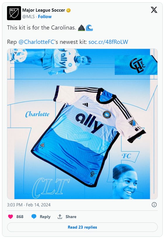
2. Charlotte FC - The Carolina Kit
Another daring risk to take that paid off tremendously. It also helps that the colorway fits the theme to perfection.
3. Austin FC - The Armadillo Kit
There’s not much in the world more subjective than fashion. I can already envision many disagreeing with this opinion. But there’s just something about this kit that I love. The faded beige gives it a vintage look while that shade of green makes it pop. Sure you can say it’s simple, but sometimes simple works and it completely does for me here.
4. Atlanta United - The Resurgens Kit
Yes, I’m biased. I don’t care. It’s a creative ode to the city’s flag. It’s a tad busy, but I’ll take busy over boring any day. Keep taking these risks.
5. Seattle Sounders - The Anniversary Kit
This is a kit you have to see in full to really appreciate. The shirt itself is good. But it’s the shorts and socks in contrast to the green that really makes it shine.
6. Real Salt Lake - Peak Utah Kit
Perhaps the most bold try of the bunch this season. They nailed the theme. It’s just a little bit too busy with the colorways they have to work with. Still a fine effort.
7. Philadelphia Union - The XV Kit
I swear the Union have one of the worst colorways in the league to work with yet still produce great kits on a consistent basis. The snake theme is on brand and works very well.
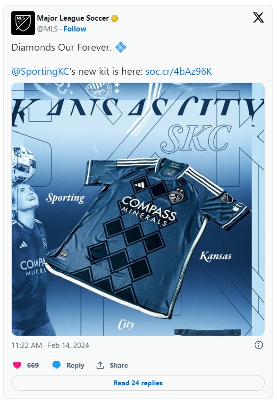
8. Sporting Kansas City - Diamonds Our Forever Kit
Not much analysis on this one. It’s just nice to look at.
9. NYCFC - 24/7 Kit
The two-tone thing works for me. It’s not overly creative but it’s a nice use of the colorway.
10. D.C. United - The Icon Kit
We’re venturing into mid territory now. But you can’t really argue with a classic home kit with a little bit of design-y aspects added in.
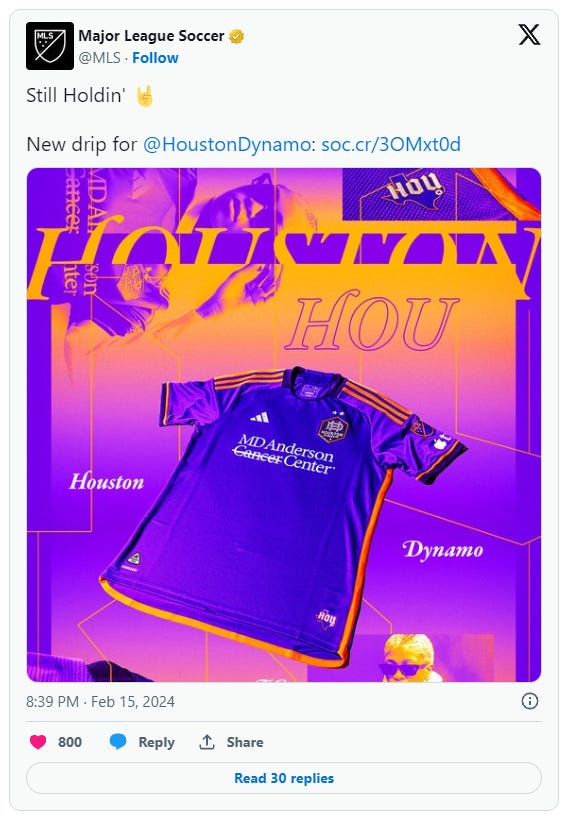
11. Houston Dynamo - Still Holdin’ Kit
Clemson.
12. Orlando City - Legacy Kit
Clemson with a retro crest.
13. Chicago Fire - Return to Red Kit
It’s a classic look. Also some credit for listening to the fans and bringing back red.
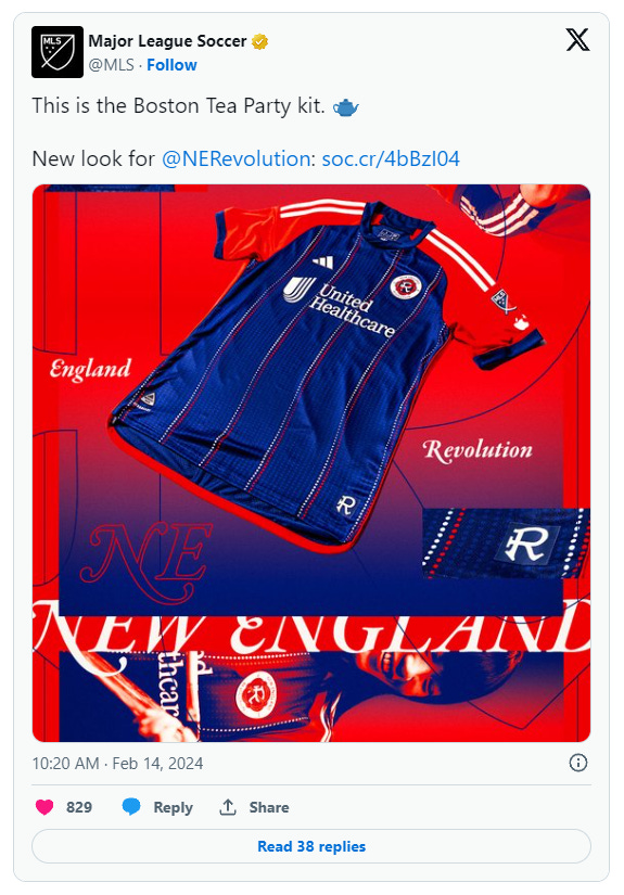
14. New England Revolution - Boston Tea Party Kit
Look. There’s only so much you can do with that colorway and a primary blue kit. It’s different, at least. But I don’t really see what the Boston Tea Party has to do with the kit…
15. Portland Timbers - Nature Unites Us Kit
I placed this one directly in the middle of the list for a reason. It’s because I can see both sides of the coin. On one hand it is quite creative and risky. But there’s just something about it that I don’t care for. Good try, but the end result is a bit of a letdown.
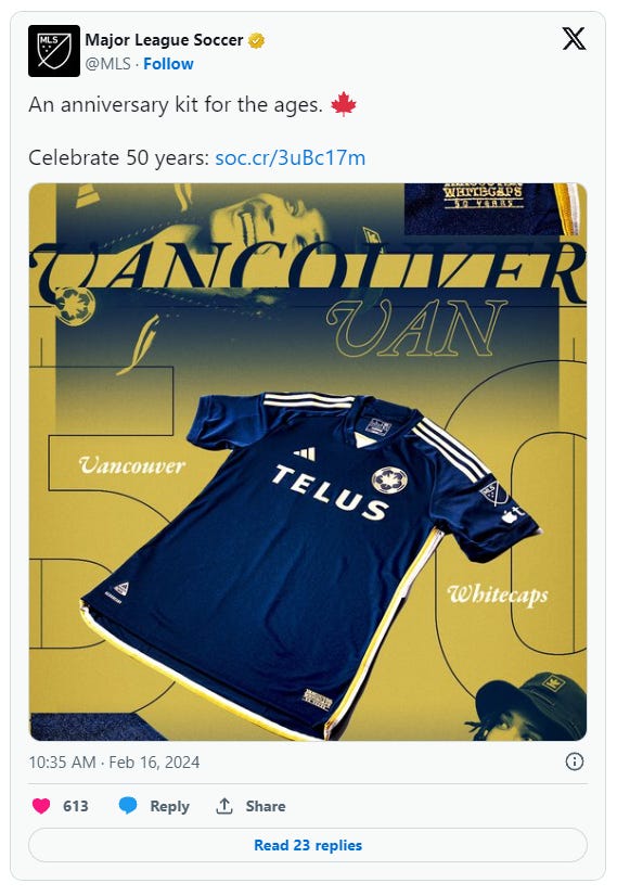
16. Vancouver Whitecaps - The 50 Jersey
It’s not too dissimilar from any Caps kit I’ve ever seen. But it’s still classic and the retro crest is a bonus.
17. Colorado Rapids - One Flag Kit
It’s fine. It’s a flag. I get it.
18. CF Montreal - La Main Kit
It’s exactly what you’d expect a Montreal kit to look like. Bonus points for not getting your kit release delayed for offending a group of people this year.
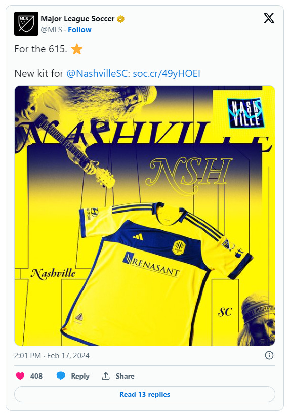
19. Nashville SC - The 615 Kit
Good job on getting the colors right, I guess. I got nothing else.
20. FC Cincinnati - The Canvas Kit
Yes, it’s a plain white kit. But the patterned trim gives it some personality. It’s decent.
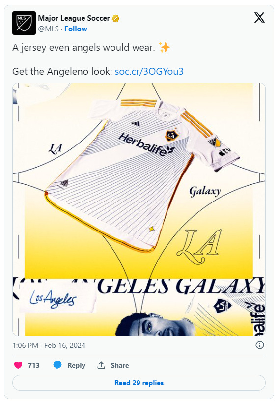
21. LA Galaxy - Angeleno Kit
It’s not awful, it’s just a weird one. We’ve seen much better from them over the years.
22. LAFC - Primary Kit
Look. LAFC have a cheat code with hands down the best colorway in the whole league. It’s almost impossible to mess up a black and gold kit. Dare I say they’ve almost done it. It just feels very uninspired with what they have to work with.
23. New York Red Bulls - Legacy Kit
There’s something unsettling about this kit. Looking at it makes me anxious. Maybe because I feel like I’m about to see 10 of them sitting behind the ball. I’m not a fan.
24. San Jose Earthquakes - The 50 Kit
I appreciate a good throwback, but if their club name wasn’t on the graphic, I would have no idea who this kit belonged to. That seems bad for the brand. Also, it’s not very creative.
25. St. Louis City FC - The Confluence Kit
Atlanta did it better in 2017.
26. Toronto FC - GTA Kit
Someone forgot to tell TFC that it’s not 2019 anymore and you’re allowed to actually design a kit. Boring.
27. Columbus Crew - The Home Kit (????)
Good grief, Charlie Brown.
28. FC Dallas - Afterburner Kit
I, too, have downloaded photoshop gradient packs before. It’s not abhorrent, but it just screams running out of new ideas.
29. Inter Miami - 2getherness Kit
Where to begin? First off, the name is comical. I’m a big fan of pink kits in general, but the centered crest is possibly the worst thing I’ve ever seen. It looks like a training kit or a knockoff you’d see at Wal-Mart. Poor Lionel.














damn this is pretty spot on